We just got back from a wonderful holiday in Italy and Switzerland. Here some images of the Tuscan splendor to feast your eyes on!
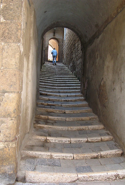
Tuscan stairs

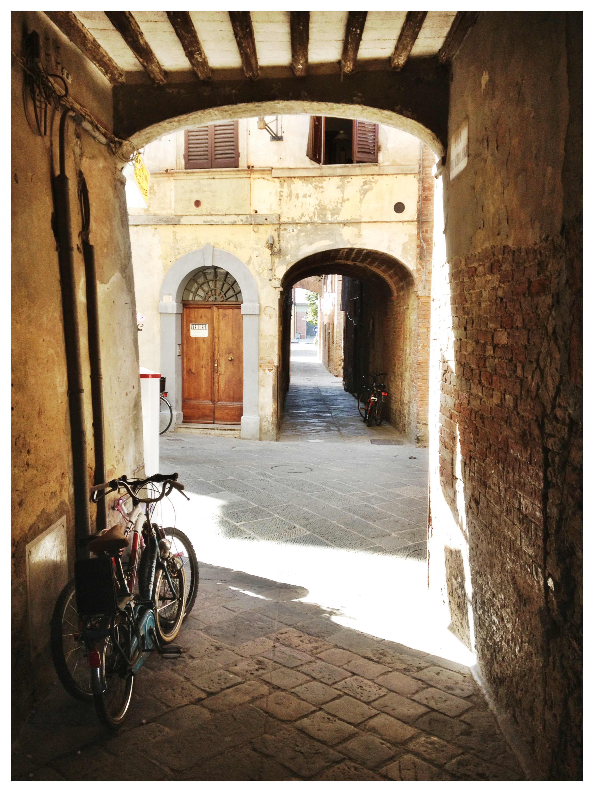
Murlo

Montalcino

Montalcino
Buonconvento

Buonconvento

We just got back from a wonderful holiday in Italy and Switzerland. Here some images of the Tuscan splendor to feast your eyes on!
Tuscan stairs
Murlo
Montalcino
Montalcino
Buonconvento
Buonconvento
Posted in General living and fun stuff
Tagged Architecture, Dolce far niente, Italian, Italy, scenes, style, Tuscany
A last post before I leave for a well deserved trip to Tuscany!
Our bathroom is showing some serious wear and tear. It’s a shame really because it’s not that old. It was installed and tiled in 2007, and looked good for about ten minutes before the tiles started fading. They are big grey slate tiles, and to be honest; I am a bit fed up with those anyway. They were a bit too much of a trend so you now see them in all renovations done between 2006 and 2010. Time for a re-tile it is.

Current bathroom tiles. They look great on the wall, it’s the floor where the problems start

You can see the faded tiles in the shower. They tick me off each day and it’s just not worth it.
We are leaving the grey slate on the walls, and I am thinking of treating them with an oil finish to make them stand out. For the floor I am either thinking black and white, or just white. Either way, a smaller tile as I think the contrast with the bigger grey slate will look great. Have a look at some of the pictures I collected on my pinterest moodboard. I looked for pictures with a distinct darker colour on the walls to highlight the contrast between the floor and walls.

Love this. It obviously means I’ll have to infuse my bathroom with a few more brocante or antique-ish items, but I guess I could give our bathroom a similar feel. Painting the bathroom rack black or dark grey/blue is a start. Maybe add a small chair?

A clean look, with small white tiles. They are not expensive either. I’d make the seams between the tiles a bit thicker to really show the contrast. And I’d make them dark. This because it would look better, but also because white seams are a nightmare to keep clean

Love this too. Small round tiles, the so-called ‘penny rounds’, found in many American bathrooms from 1940’s and 1950’s. I love how they instantly give character to a bathroom

I also thought of maybe going for a more elaborate floor with a massive contrast effect. But as we are thinking of maybe putting up the house for sale next year, this might not be too great an idea…..

Just look at the floor in this one as the rest is a bit tacky. I do have a thing for marble though….. I bet this would look great with the rugged, dark slate…. But I am dreading even thinking of the final invoice….
What do you reckon I should do?
Posted in General living and fun stuff, See how others live
Tagged bathroom, bathroom tiles, black, Cheap, contrast, design, effect, grey slate, ideas, marble, slate, slate tiles, tiles, wear and tear, white
It was as if we were forced to say goodbye to our good old lightbulbs. From one day to the next, or at least it felt like it, the cosy glow, lamps that actually lit up right away, were harder and harder to find on the shelves. We were all a bit confused why they were bad for us all of a sudden. And even more frustrating, in return we were given weird shaped fluorescent lamps exuding harsh and unfriendly light. And it took forever to actually exude anything. Sometimes it took minutes to light up completely. The dissatisfaction we felt might be part of the reason why we are not all loving LED bulbs. Because LED bulbs offer all the good things we liked in our good old bulbs, yet without compromising on our demand for green and eco-friendly. The light is warm, cosy or bright if you need it, and the bulb lights up immediately after its switched on. And what’s best; LED light comes from computer chips. Companies like Philips have already developed special products and apps that allow you to control the colour or brightness of lighting from you smart phone or tablet. Imagine the possibilities!

Example of an interior design making use of LED lighting
Designers were the most adamant opponent of LED. Yet they are now also the group embracing LED because of its sheer endless stream of opportunities. More and more architects, designers and artists choose to use LED in their work. The CN tower in Toronto for instance was relit in 2007 making use of LED. Before that the tower was sparsely lit to save energy. LED allows to illuminate the tower fully, with even less energy. And this is just one of many examples of the last few years.

The CN tower is lit with LED since 2007

After a long refurbishment, the Dutch Rijksmuseum in Amsterdam decided to commission Philips to light up the building with LED
Slowly but gradually consumers are embracing LED too. People from the industry expect LED to be responsible for 16% of sales in the residential sector by 2015. Since it’s introduction, LED has grown in popularity and has shown to be in increasing demand by consumers. Interior designers, lamp manufacturers and home/deco stores believe in LED too, and are eager to tell their customers why. A representative of New York based Oriental Lamp Shade Company commented on how consumers can benefit from LED. “LED lasts a lot longer than regular incandescent lighting. Not only does this mean customers save money, but it also makes LED more eco-friendly. We find that to be an important consideration for customers when they buy lamps and lighting. The rather steep investment pays itself back in more ways than just the longevity. LED uses far less electricity too. Something consumers are beginning to realise more and more. We think eventually LED will be the main source of light we all use”.

A stunning wine cellar with LED lighting as part of the main design
We all know the feeling. You come back from that amazing holiday, or just had the best party EVER, or managed to capture your pet’s best portrait on your digital camera or iPhone. But then what? Most pictures these days don’t make it further then a Facebook post or a tweet. And after your phone stops allowing you to pick up calls because it is maxed out with data, the picture folder eventually needs to be emptied further limiting the life span of those pictures. It might be worth saving some and printing them on canvas or acrylic as wall art.

Create your own personalised wall art
Try going for a bit more quality then you get at your average copy shop or photo booth. A great site to check out is www.fotoviva.co.uk. I did a search online and they are one of very few that deliver worldwide. Plus they print on gallery quality canvas and acrylic, which makes the result look a lot better. They also have a pretty cool online gallery with stock images, both photographs and art, to choose from if your own pictures are not cutting it. Acrylics start at £60 and canvases start at £35.

An example of the stock images at http://www.fotoviva.co.uk
Try mixing your own personalised wall art with existing images or prints you have, and frame those in different frames to create a unique collage. If you paint the wall in a contrasting colour, it’ll make the wall stand out!

Not all pictures and wall art need to be framed. The Ikea portrait of Audrey Hepburn in this example could be replaced with a canvas of your own pictures.
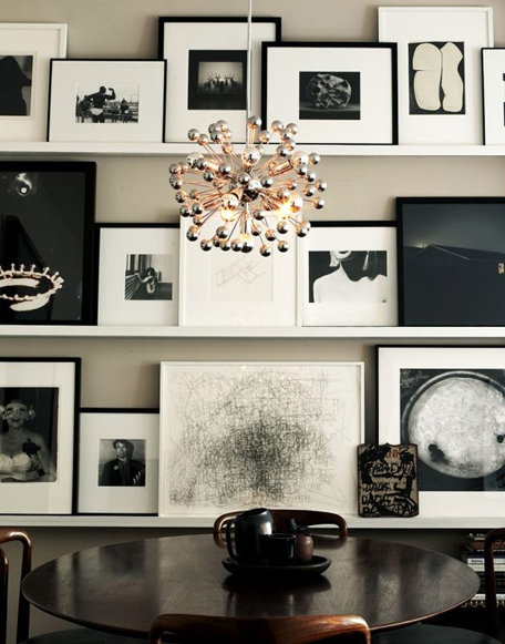
Instead of hanging the wall art on the wall, create ledges, to allow for regular changes to your collage. In this case, a black and white themed wall art collage creates a sleek and retro feel.
You’ll find that a wall with custom art will get the attention of both you, and your friends and family. You can even theme your wall according to the occasion or holidays.

Another example from the stock gallery at Fotoviva. This image would work great in both a modern, and retro interior. The colours even work in a classic style home. Especially when printed on high gloss acrylic!
Posted in General living and fun stuff
Tagged acrylic, art collage, canvas, custom, Fotoviva.co.uk, gloss, illustration, images, prints, quality canvas, shipping, wall art, worldwide


