So yes, this happened.
Remember I told you about the exam I took a little under a year ago? I designed a twenties/Art Deco revamp of a dated house with great character. The lady examiner that graded me said that she loved my drawing style and gutsy design, but she detested my colour scheme.. bright fuchsia pink and royal blue. I knew for a fact that my colours were right on, especially considering the brief. But I kept it to myself as this lady was still to grade me. I passed, but with the extra remark that I needed to be aware of colour trends.
Imagine my pleasant surprise when I saw this post about a table revamp by Naomi Stein over at Design Manifest. I don’t want to say it but can’t help it…
I TOLD YOU SO!

Table revamp by Naomi Stein in post on Apartmenttherapy.com
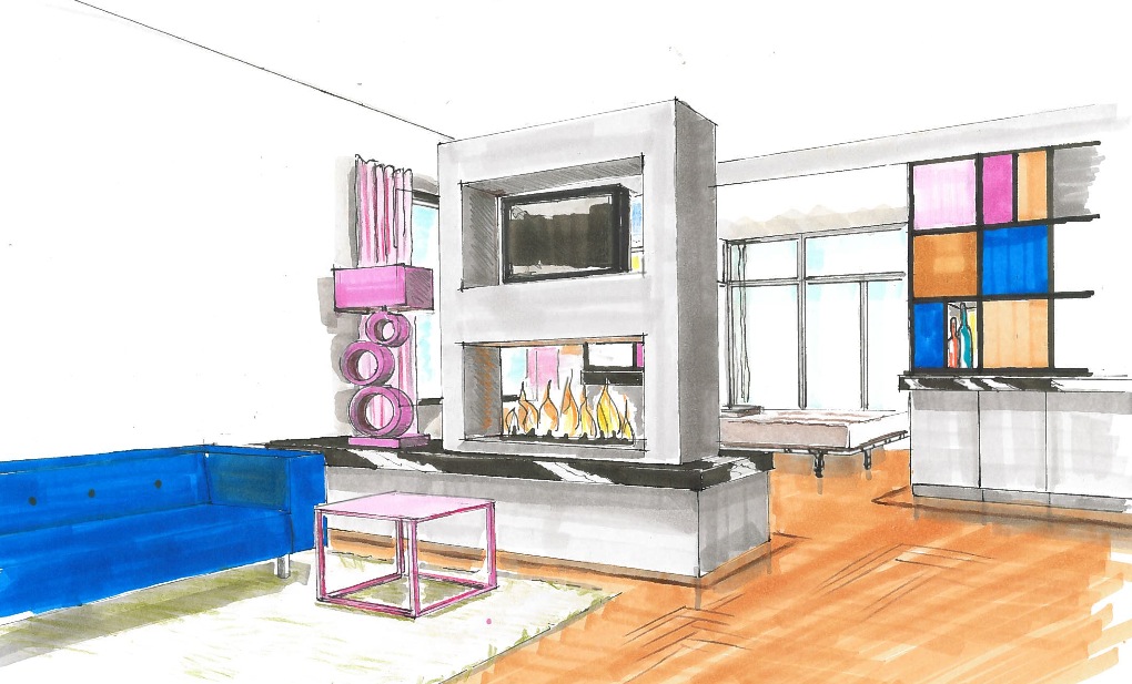
My design for a revamp of a 1930’s house

My design for a revamp of a 1930’s house